Improving Contractor Discovery on the Dulux Connect Platform
CLIENT
Dulux Connect
ROLE
UI / UX Lead Designer
PRODUCT
Web Application
The Dulux Connect platform struggled with low engagement between professionals and contractors. Through user research and UX redesign, the platform introduced improved search, fuzzy filtering, profile comparison, and a more intuitive contractor portal to increase connections and completed profiles.

CLIENT
The Dulux Connect platform connects construction and facility professionals with contractors. Contractors can create a profile where they introduce themselves and showcase their projects.
Construction and facility professionals can use the platform to find contractors, evaluate whether they are a good fit, and contact them directly.
However, the platform was facing several challenges. Few contacts were being made and only a limited number of contractors were creating profiles.

UX DESIGN
To better understand the problem, we conducted interviews and workshops with professionals, contractors, and members of the Dulux sales team.
From these sessions we identified several issues. The search experience was not intuitive. Professionals were initially presented with a large list of contractors, which caused information overload. However, when using filters, the opposite happened: the results were often reduced to zero contractors that matched the criteria.
Another issue was that comparing contractors was difficult. Viewing profiles required multiple clicks, and users had to repeatedly navigate back and forth between the overview and individual profiles.

Fuzzy Filter and questionaire
To improve the search experience, we redesigned the filtering system. Instead of forcing users to apply strict filters immediately, we introduced a fuzzy filtering system combined with a questionnaire.
By answering a few simple questions, professionals could gradually narrow down the results while still seeing relevant contractors. This approach prevented both information overload and empty search results.
Profile comparisson
To make comparing contractors easier, we introduced a shortlist feature. Users can add contractors to a shortlist and view them side-by-side for comparison.
Contractor profile pages appear in an overlay drawer, allowing users to quickly review profiles without leaving the search page. This significantly speeds up the browsing process by removing the need to constantly navigate back and forth between overview and profile pages.


Portal UX
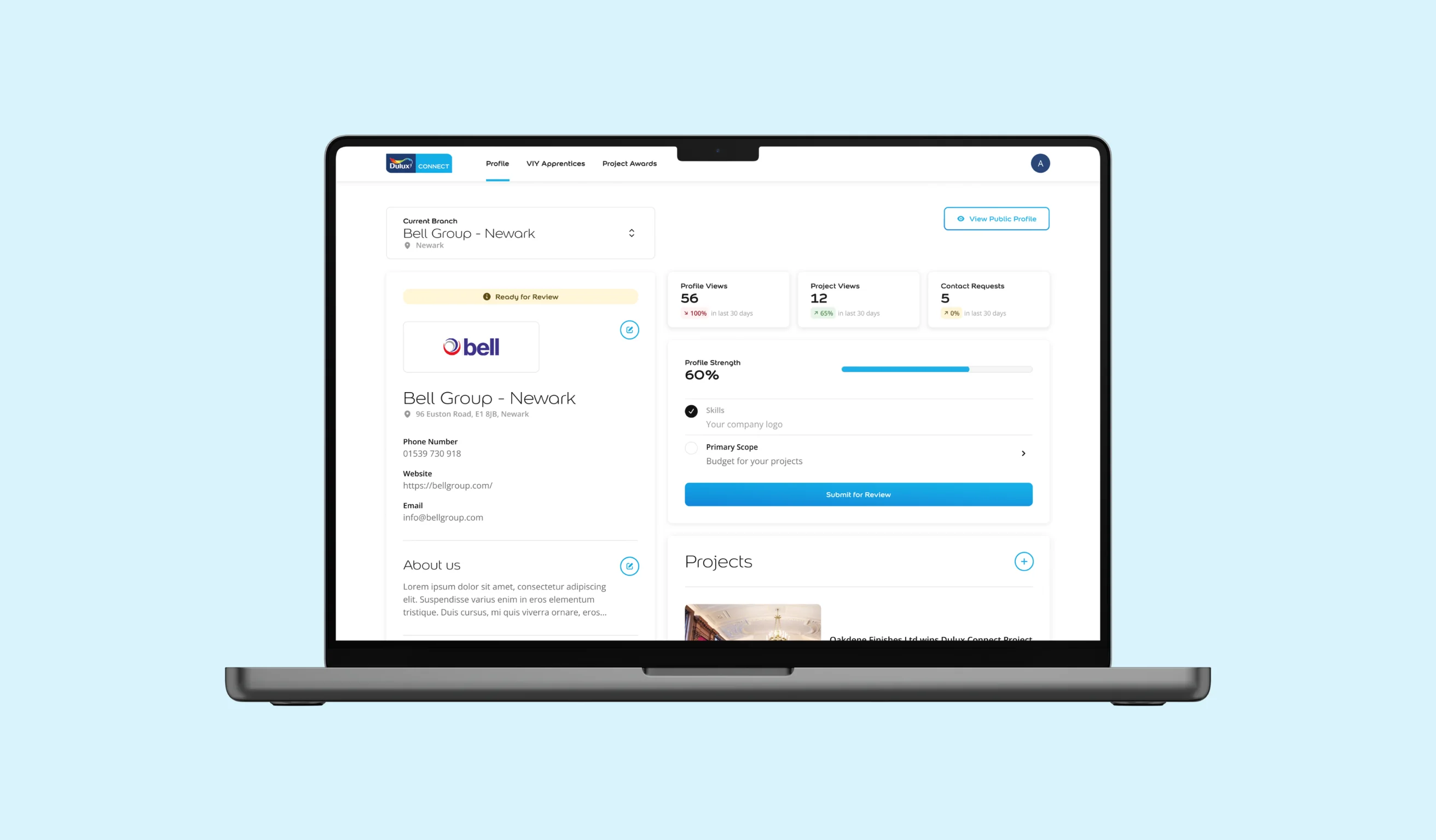
From our research we discovered that contractors with fully completed profiles received the most contact requests. Completing the profile therefore became the most important action for contractors on the platform.
The new design focuses strongly on this goal. We introduced a progress bar and step-based flow to clearly show how far a contractor is in completing their profile.
We also removed several informational pages from the old design. Interviews revealed that these pages were unnecessary and distracted from the main objective: completing the profile.
The profile editing experience was redesigned as well. Instead of long rows of form fields, the interface now resembles the final public profile, making the process more intuitive and easier to understand.
Finally, we added a preview button so contractors can view their public profile and experience the platform from the perspective of a professional searching for contractors.